800.942.4447


 Addresses
 Wallet
 Orders
 Invoices
 Item History
 Favorites
 Change Password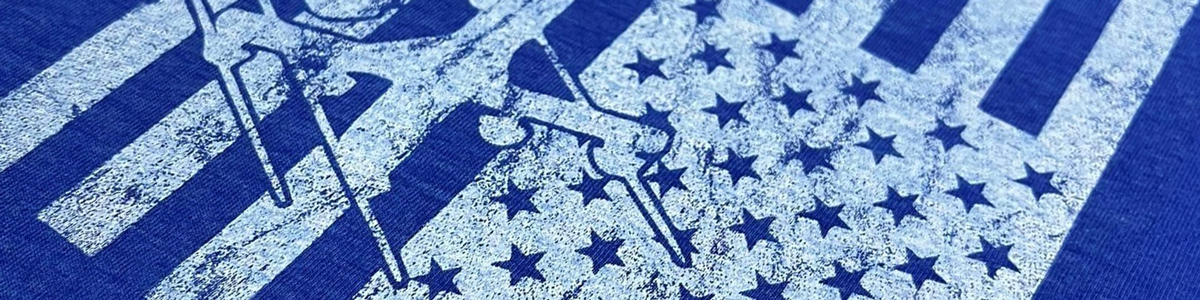
The best screen printing ink for a vintage T-shirt look should produce soft color without creating a heavy plastic layer on the garment. The finished design should appear comfortable, slightly faded, and integrated into the fabric rather than sitting prominently on top of it.
Our Watercolor Series and Watercolor LC Series are both designed specifically for this type of printing. They provide the soft feel associated with water-based ink while retaining the production advantages of plastisol, including not drying inside the screen.
What Creates A Vintage T-Shirt Print?
A vintage print is created through a combination of ink, artwork, garment, and ink deposit. Simply choosing a muted color does not guarantee an authentic worn appearance.
The most convincing vintage prints normally include:
- A soft, low-profile ink deposit
- Slightly muted or weathered colors
- Artwork designed with intentional distressing
- Garments with a soft or washed surface
- Minimal underbase whenever possible
- Controlled mesh, stencil, and squeegee pressure
The goal is not to make the print weak or under-cured. A properly made vintage print should still be durable even though it looks and feels broken-in.
Watercolor Series For A Classic Vintage Look
The Watercolor Series is a plastisol alternative to traditional water-based textile ink. It produces a super-soft, worn appearance without drying in the screen or requiring the extended drying process associated with some water-based products.
Watercolor is particularly useful for:
- Retro logos
- Band and event shirts
- Distressed athletic graphics
- Fashion designs
- Soft prints on light cotton garments
- Artwork intended to resemble an older shirt
The recommended mesh range is approximately 125 to 230, depending on the artwork and desired deposit. Higher mesh counts generally create a thinner, softer print, while a more open mesh produces stronger color and coverage.
Watercolor normally cures between 320°F and 330°F. Confirm that the complete ink deposit reaches its required cure temperature rather than assuming a faded-looking print should receive less heat.
Watercolor LC For Low-Cure Vintage Printing
The Watercolor LC Series creates the same type of soft, water-based-style print while curing at a much lower temperature.
Watercolor LC can cure between approximately 250°F and 270°F, making it useful for:
- Heat-sensitive garments
- Shops already using low-cure inks
- Soft vintage printing on delicate fabrics
- Reducing unnecessary garment heat exposure
- Four-color process-style artwork
It also does not require special water-resistant emulsion or an emulsion hardener, and it will not dry in the screen during normal production.
Like standard Watercolor, Watercolor LC can normally be printed through mesh counts from 125 to 230. Always test the selected garment because low curing temperature alone does not guarantee protection from dye migration or other fabric-related problems.
Which Watercolor Ink Should You Choose?
Choose standard Watercolor when you want a soft vintage plastisol and your garments can comfortably tolerate a traditional curing range.
Choose Watercolor LC when:
- Your production already uses low-cure ink
- The garment is sensitive to higher temperatures
- You want to reduce heat exposure
- You need a soft general-purpose or vintage-printing option at approximately 250°F
Both products are excellent choices for a worn aesthetic. The primary difference is the curing temperature and the types of production environments in which they fit most naturally.
Print Directly On Light Garments
The softest vintage print normally comes from printing directly onto a light-colored garment without an underbase.
Good garment colors include:
- White
- Natural
- Heather gray
- Sand
- Light blue
- Light yellow
- Pastel colors
Because some garment color shows through a thinner ink deposit, the print naturally appears less saturated and more integrated into the shirt.
This effect should be anticipated during artwork and color approval. A color viewed in the container will not look identical after being printed thinly onto a colored garment.
Printing Vintage Designs On Dark Shirts
Dark garments are more challenging because bright colors normally require a foundation. A heavy white underbase can make the print feel thicker and reduce the soft vintage effect.
Several approaches are possible:
- Use muted tone-on-tone colors without an underbase
- Use a thin, controlled white underbase
- Distress the underbase and top colors together
- Use a compatible discharge base on suitable garments
The standard Watercolor Series can be combined with a discharge base to produce vibrant colors on black shirts with very little finished feel. Discharge printing should only be used on compatible, dischargeable garments and requires the proper activator, ventilation, handling, and curing process.
When using a conventional white underbase, keep the deposit as smooth and thin as the required opacity allows. A thick underbase beneath soft top colors defeats much of the purpose of choosing vintage ink.
Use Artwork Designed For The Effect
Vintage ink performs best when the artwork already supports a worn appearance. Distressing should be intentional rather than caused by poor screen exposure or incomplete printing.
Common design techniques include:
- Small distressed openings
- Weathered edges
- Broken solid areas
- Halftone shading
- Reduced color palettes
- Retro typography
- Slightly muted color combinations
Make sure distressed openings are large enough to expose and print reliably. Extremely small random marks may fill during coating, exposure, printing, or reclaiming.
Intentional distressing creates consistent results across the order. Relying on uneven pressure or incomplete screen clearance creates garments that look defective rather than vintage.
Choose The Right Mesh Count
Mesh count has a major effect on print feel. A lower mesh count deposits more ink, while a higher mesh count generally produces a thinner and softer layer.
Within the recommended 125-to-230 range:
- Use the lower portion for stronger color or larger distressed solids
- Use the middle range for general vintage spot-color work
- Use the higher portion for fine detail, halftones, and the softest deposits
The ideal mesh also depends on stencil thickness, screen tension, ink viscosity, and artwork. Test the design rather than automatically choosing the highest mesh count.
Control The Ink Deposit
Vintage printing is not achieved by under-printing the design. The stencil should clear completely, but the deposit should remain controlled.
For a softer print:
- Use a thin, even stencil
- Maintain good screen tension
- Use a sharp squeegee edge
- Apply only enough pressure to clear the image
- Begin with one print stroke
- Avoid unnecessary print-flash-print sequences
Excessive pressure may drive ink into the garment and blur distressed detail. Multiple strokes can make the print more opaque but also heavier and less authentic.
Garment Choice Matters
A soft ink cannot make every shirt feel vintage. Heavy, stiff garments may still produce a noticeably different result from lightweight ringspun or garment-washed cotton.
Good candidates often include:
- Ringspun cotton
- Combed cotton
- Garment-dyed shirts
- Heathered blends
- Lightweight fashion tees
- Pre-washed garments
Blends and polyester garments require testing for dye migration, heat sensitivity, and adhesion. Some heather garments produce an excellent vintage appearance, but their synthetic content may affect the ink and curing process.
Use Muted Colors Intentionally
Traditional vintage palettes often use faded reds, weathered blues, warm creams, mustard yellows, olive greens, and softened blacks. However, the colors do not need to be dull unless that supports the design.
A thin deposit naturally allows the garment to influence the finished color. Always approve a fully cured sample on the production shirt rather than matching the wet ink inside the container.
If custom colors are mixed, record each component by weight. Keep the mesh, garment, underbase, and print strokes consistent so repeat orders match the approved sample.
Do Not Under-Cure The Ink
A vintage print should look worn, but it should not begin washing away after the first laundering. Under-curing is a production failure, not an aging technique.
Standard Watercolor and Watercolor LC have different curing requirements. Follow the correct range for the exact product and verify the complete ink film, particularly where the artwork contains heavier deposits.
After curing:
- Allow the garment to cool completely.
- Inspect the surface and detail.
- Stretch the print when appropriate.
- Wash and dry the sample.
- Compare it with the approved appearance.
The print may soften further after washing, but it should remain securely bonded to the fabric.
Common Vintage Printing Mistakes
- Using a heavy high-opacity ink deposit
- Printing a thick white underbase beneath every color
- Using too many print strokes
- Creating distress marks too small to reproduce
- Trying to create wear through incomplete printing
- Choosing a stiff garment
- Approving color from the bucket instead of the cured shirt
- Under-curing the ink to make it appear older
Final Thoughts
The Watercolor Series and Watercolor LC Series are ideal choices for creating a soft vintage T-shirt print without the screen-drying concerns of traditional water-based ink.
Use standard Watercolor for a classic vintage plastisol with a traditional cure range. Choose Watercolor LC when low-temperature curing and reduced garment heat exposure are important.
For the most authentic result, combine the ink with distressed artwork, a soft garment, an appropriate 125-to-230 mesh, and a controlled deposit. Print directly on light fabric when possible and keep any dark-garment underbase thin.
A successful vintage print should look comfortably worn while remaining properly cured, washable, and repeatable.